Suspense fallback
Loading
Preparing pagePlease wait1%
CodeDesignShip
Preparing a focused brutalist interface for projects, skills, writing, and product work.
Suspense fallback
Frontend Development + 2026-06-12 + 9 min read
A practical checklist for building responsive Next.js landing pages that look polished on mobile, load quickly, and support clear conversion goals.
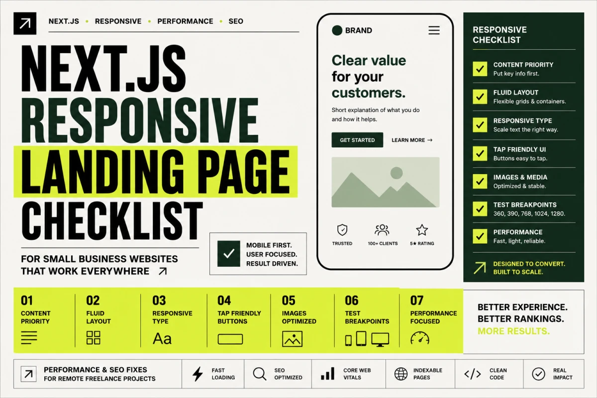
A landing page can look impressive on a large monitor and still fail where most visitors actually see it: on a phone. Mobile responsiveness is not only about shrinking text. It is about deciding what matters first, how content should stack, which actions should stay visible, and how the page should feel when someone scrolls with one thumb.
For small business websites, portfolios, SaaS pages, and service pages, a responsive landing page should feel intentional at every width. It should load quickly, explain the offer clearly, and make the next action easy.
Responsive design starts before CSS. It starts by deciding the order of information.
On desktop, a hero may support multiple columns: headline, supporting copy, metrics, image, and navigation. On mobile, those same pieces need a stronger hierarchy.
A practical mobile order is:
If everything is treated as equally important, mobile users have to work too hard. A good responsive page makes the first screen clear without hiding the rest of the story.
Fixed widths are one of the most common causes of broken mobile pages. A landing page should use flexible containers, responsive grids, and safe maximum widths.
Useful patterns include:
w-full for sections that should fill the viewport.max-w-* for readable content.grid or flex with breakpoint changes.min-w-0 for text inside flexible rows.overflow-x-hidden only as a last safety layer, not as the main fix.The goal is to make the layout naturally fit the viewport instead of hiding overflow after it happens.
Large display type can create a strong visual identity, but it needs responsive sizing. A fixed hero title that works at 1440px may overflow at 390px.
For responsive typography, check:
The best mobile typography feels designed, not merely reduced.
Calls to action should be comfortable on touch devices. A button that is visually compact on desktop may become frustrating on mobile.
Good mobile buttons usually have:
If a landing page has two primary links, the mobile layout should make the main action obvious and place the secondary action nearby without competing too much.
Images can make a landing page feel real, but they can also break responsive layouts. Product screenshots, portfolio images, and hero media should have stable aspect ratios and appropriate sizing.
Review:
In Next.js, the Image component can help with sizing and optimization, but the surrounding layout still needs thoughtful constraints.
A useful responsive check includes more than one mobile width. I usually check at least:
For each width, look for horizontal scrolling, overlapping text, cramped buttons, awkward image crops, and sections that become too tall without reason.
Mobile users are often on slower networks and lower-powered devices. A responsive landing page should also be lightweight.
Performance improvements may include:
Responsive design and performance are connected. A page that looks good but feels slow still loses trust.
A strong Next.js landing page should work across mobile, tablet, and desktop without losing its personality. The design can still be bold, but the implementation needs flexible layout rules, responsive type, stable media, and clear content priority.
For small business websites and portfolios, this work is practical. It helps visitors understand the offer faster, trust the page more, and take action without fighting the interface.
A responsive landing page adapts layout, spacing, typography, images, navigation, and calls to action across mobile, tablet, and desktop without horizontal scrolling or broken content.
Many visitors first open a small business website on a phone, so mobile layout quality directly affects trust, lead generation, and conversion.
Yes. Strong visual style works well when the design uses scalable typography, flexible grids, optimized media, and clear content priority at each breakpoint.
Have an idea or project?
Let's build something amazing.アイデアやプロジェクトがありますか?素晴らしいものを一緒に作りましょう。